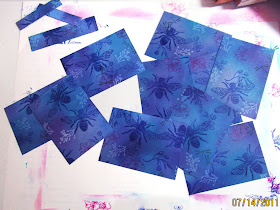
Direct To Paper Technique
By Connie Holso
This is a simple and easy way to turn plain cardstock into beautiful custom backgrounds. I usually do several sheets in different colors at one sitting. You will get totally different looks just by what colors and stamps you choose.
Supplies:
- Medium to dark-toned cardstock
- Pigment inks (Colorbox or Cats Eyes) in light, medium, and dark – 4-6 colors is good
- Assorted small to medium sized stamps
- Optional: dye inks for over stamping
- Scrap paper for covering work area
Process:
You will want to lay down some scrap paper to protect your table. I always get out more inks and stamps than I need as I usually decide as I go along unless I am doing it for a specific project.
For this technique you need pigment ink for covering the paper with ink because it stays wet letting you move it around and blend it. Dye ink does not work as it is absorbed too fast. Also it is transparent and just stains the paper. Because pigment ink is opaque it will let you completely change the paper color. You can not achieve the glow that the pigments give with dye inks.
I mostly just use whatever inks I have in the colors I want for over-stamping, except for stamping with light colors, for those you will need to use your pigments. Otherwise both dye and pigment inks work fine.
When choosing your inks you want to use the white or very light colors first as they are what make your paper “glow”. They also make the other colors brighter and help make the stamped images pop.
 |
| Smearing white ink over entire paper. |
Begin by smearing your lightest color (white here) lightly over the surface of the cardstock. This works best if your ink pad is a bit on the dry side. If it is new and quite wet, use a sponge instead of the pad. This first light coat of ink just makes a base so it is easier to move the other colors around and blend the edges together. It also helps give more luminosity to the page.
NOTE: Use caution if you use your pads to add the ink to the paper as too firm of pressure can damage the foam ink pad.
 |
| I use white for my first color. |
Next using either the pad itself or a sponge add more white in splotches making some go off the page. This is so it will not have an “edge” and will look evenly colored when cut into pieces. It will look messy but that is how it should be.
 |
| I used Dusty Plum for my second color. |
Now add your second lightest color, again in splotches, with some going off the page, blending the edges just a tiny bit. You want it to be quite blotchy as each layer will blend it more.
Continue adding colors from light to dark until you are satisfied. You want good contrast but if you do get a spot too dark you can add more light ink (or ink in a lighter tint of your paper color over the dark spot to soften it.
When you are satisfied with the background, you will stamp over it. You can use either pigment or dye inks for stamping, or even some of each. I just use whatever I have in the colors I want for the project.
This sample shows some images in pigment (midnight) and some in dye (blueberry) and you really cannot tell the difference.
Usually I stamp my largest images first, spacing them randomly over the paper. You may want to stamp them in different directions so there is not an up or down to the sheet. Fill in around the large images with smaller stamps in different colors until the sheet is full, being sure to stamp off the page to avoid an “edge”.


Very clever... love it!
ReplyDelete